We’ve all done it. We’re moving at breakneck speed to release a project due at the end of the day and think, “I spell-checked this last time.” “I’m pretty sure it’s got the right logo and URL.” And off it goes to the vendor.
Fast forward to getting your proofs. OOOOPS. You notice ‘form’ should be ‘from’ in the fourth paragraph. Your slug says your postcard is 6×4, but the art is 7×5 and doesn’t fit into your #10 package. Why does that photo look so blurry? You forgot to update the FPO image with the high-resolution version.
No amount of crunch time should deter you from making sure your files are accurate and print-ready. If you already have a checklist, make sure it’s up-to-date and includes all client changes that may have occurred over the past 12 months. If you don’t have a checklist, put one together.
Don’t rely on your good memory. Rely on your checklist. Here are a few items on mine. What are some of yours?
- Spell check!
- Are all addresses, phone numbers and URLs accurate? Do they match across all other components?
- Is your QR code live and accurate? Does it scan correctly to the appropriate landing page?
- Is the client enrolled in Informed Delivery? (Check out the USPS promotions and incentive program: https://postalpro.usps.com/promotions/2023-ID) Make sure the URL is live two weeks before the mail date.
- Does the signature match the sender?
- Is all art print-ready? Designers often use FPO (for placement only) images to keep their file size down; make sure you replace it with the high-resolution version (minimum 300 dpi) before sending it to your vendor.
- Spell check!!
- Remember the scanline on the reply device – make sure there’s a clearance zone of one-half-inch all around, with no color or graphic elements.
- If you have perforations on your component, is it live (the perf line will show in ink) or blind (no ink)?
- Make sure proofing AND branding guidelines are being met for each client. You can even develop a cheat sheet of each client’s idiosyncrasies that aren’t listed in their brand guide, including things like: Do they prefer serial commas? Spacing before/after dashes or ellipsis? What about using a colon (:) after P.S.?
- Spell check!!
- Make sure slugs are correct.
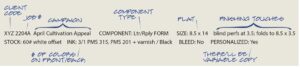
- Make sure all components fit the package. Check with your vendor/mail shop to ensure your finished pieces meet their clearance requirements. For example, many shops won’t accept a #9 return envelope in a 6×9 carrier without folding it.
- Make sure all edits from previous decks have been implemented.
- Spell check!!
- It’s P.P.S. — not P.S.S.
- Confirm that the return envelope uses correct FIM and barcode art. If you need to create a new size envelope, contact the USPS to create art rather than resizing existing RE art to fit the new size. Check out their site: https://pe.usps.com/MailpieceDesign/Index?ViewName=ABRMIntroduction
- Spell check!!
- Always take the extra time to double-check your files one last time before zipping them off to the printer. Trust me on this.
And if you need expert guidance on polishing your mail campaigns, email us at Hello@theharringtongagency.com.